One of my 2021 resolutions was to engage with Tidy Tuesday more often. I’ve dabbled in the past but never recorded my work or published it. This week’s data was a catalogue of the Tate collection, and there have been some rather fantastic visualisations, no doubt inspired by the fact the subject matter is art.
The other week I saw a tweet by Ijeamaka Anyene showcasing some fabulous artistic plots made in R by using the coord_polar() function within {ggplot2}. So I’ve had art on my mind recently and seeing the outputs of this week’s Tidy Tuesday working with the Tate collection reminded me that I had promised to engage with Tidy Tuesday more routinely.
This week’s data comprised two datasets, one containing information on artists and one on artworks. One of the largest components of the Tate Collection is a large volume of works by JMW Turner as a result of his will gifting them to the nation when he died. But what about the other works in the Tate’s collection, how did they come to be part of it. I decided that I’d try to find a way of visualising this. Within the artworks dataset there is a column called creditLine that provides details on how each artwork came to be part of the Tate collection. Through some initial investigations of the dataset I developed some code to categorise artworks into one of 12 acquisition reasons:
art fund- purchases assisted by the Art Fundartist rooms- works in the ARTIST ROOMS collectioncas- purchases assisted by the Contemporary Art Societydeath- acquisitions due to death, e.g. artworks bequeathed in a will, donated in memory of an individual, or purchases via a financial legacygift- artworks given by individuals/organisations as a gift to the Tatemembers- artworks purchased by Tate Members/Friends of the Tate/Patronspurchase- direct purchases from the Tate’s general fundssupported purchase- direct purchases supported with funding from another institutiontax- artworks given to the nation in lieu of tax payments and assigned or transferred to the Tatetransfer, external- artworks transferred from other galleries, museums or cultural institutionstransfer, internal- artworks transferred from the library, archive or reference collectionturner- artworks from the Turner Bequest
You can see the code to clean the dataset and generate my reason column here1.
Having created this column the next step was to generate some data for visualisation. We can see that by far the largest reason for artwork being in Tate collection is the Turner bequest, comprising almost 38,000 individual artworks. The next largest category is “gift”, accounting for just over 11,000 artworks; followed by 7,600+ purchases.
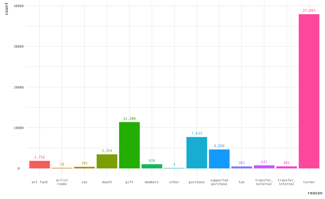
The Tate collection by reason for acquisition
The Turner bequest relates largely to Turner’s own works, which will be artworks created during his lifetime. What about visualising the reason by year the artwork was created (rather than year of acquisition).
why_year <- why_work %>%
  count(reason, year) %>%
  mutate(reason = str_wrap(reason, 10)) %>%
  drop_na() %>%
  filter(reason != "other")

ggplot(why_year, aes(x = reason, y = year, size = n, colour = reason)) +
  geom_point(position = "jitter", alpha = 0.35)
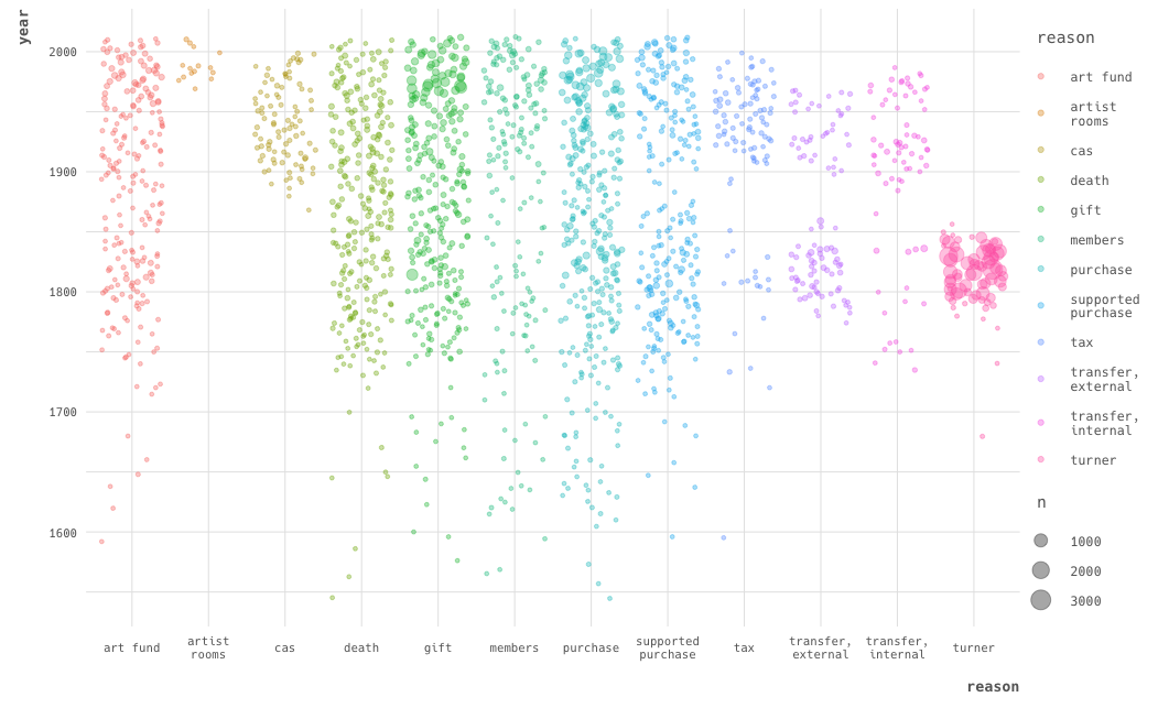
Artwork by reason and year of artwork creation
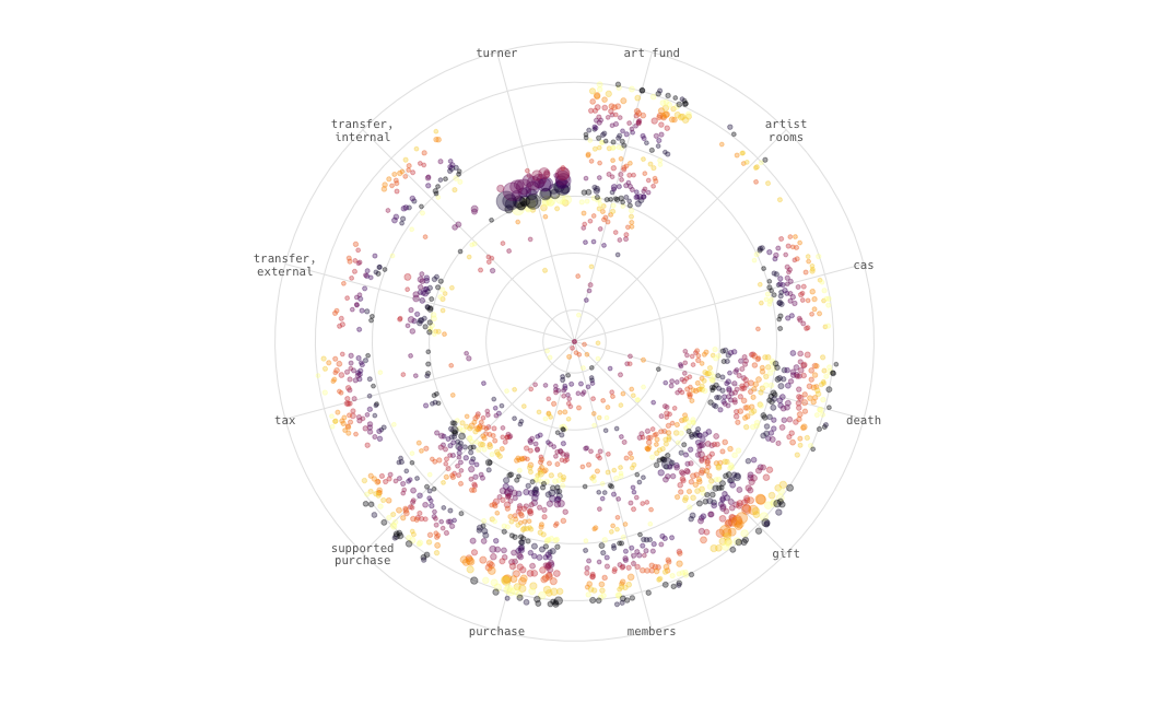
This arrangement has reduced the dominance of the Turner bequest in the visualisation. Each point represents a combination of reason and year with the size of the point corresponding to the number of artworks donated that year for that reason. The Turner bequest is largely limited to Turner’s lifetime, while artworks acquired by gift, purchase, death, and the Art Fund stretch over the full range of the collection’s timespan. The ARTIST ROOMS works are particularly concentrated in the most recent years as this is a current initiative to acquire works of artists currently practising. Works transferred have two clusters which might be a function of the Tate’s establishment as the national collection of British art from 1500 onwards and international modern and contemporary art from 1900 onwards. Most works given in lieu of tax date to after 1900, which suggests they are likely modern artworks allocated by the Acceptance in Lieu scheme2.
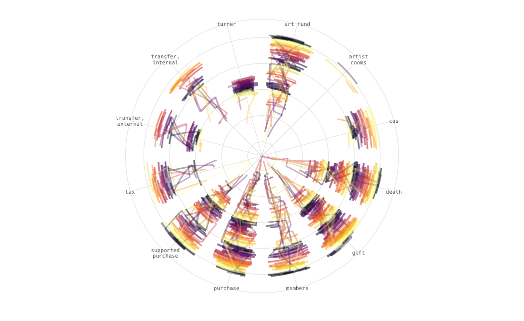
It’s certainly better, but it’s not a particularly artistic plot. Let’s finally take some inspiration from Ijeamaka and throw a coord_polar() on the end to convert from cartesian (square/x-y) coordinates to polar (i.e. circular) coordinates.
ggplot(why_year, aes(x = reason, y = year, size = n, colour = reason)) +
  geom_point(position = "jitter", alpha = 0.35) +
  coord_polar()
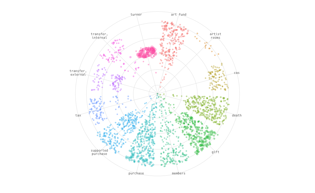
Artwork by reason and year, using polar coordinates
Switching to polar coordinates has reduced the white space, but at the moment we’re currently still colouring our points by reason. Let’s use the year information to colour our points, the vertical (spoke) axis charts the year linearly, but let’s extract the decade from the year and use that to colour the points, this would generate a banding through each reason’s ‘slice’ of points. Let’s also switch away from {ggplot2}’s native colour scale, after some experimentation I decided on the inferno scale from the Viridis set of colour scales.
why_year <- why_work %>%
  count(reason, year) %>%
  mutate(decade = str_sub(year, 3, 3),
         reason = str_wrap(reason, 10)) %>%
  drop_na() %>%
  filter(reason != "other")

ggplot(why_year, aes(x = reason, y = year, size = n, colour = decade)) +
  geom_point(position = "jitter", alpha = 0.35) +
  coord_polar() +
  scale_colour_viridis_d(option = "inferno")
Artwork by reason and year, using polar coordinates with points coloured by decade
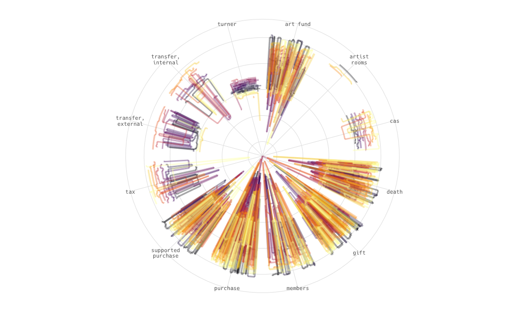
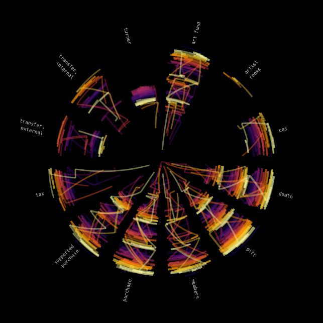
While this looks a bit like a pointillist painting, let’s switch away from point to brush strokes, which we can do using geom_path(). geom_path() is usually used to create line graphs, it connects points in the order they are sequenced in the dataset, whereas geom_line() connects points in order via the x-axis. There didn’t seem to be much difference between the two, but I decided to stick with path as there’s no meaningful x-dimension for the positioning of the points within each slice, as it’s a cateogrical x-axis the plots have been using the position = "jitter" argument to randomly distribute points within each category’s domain in the x-axis. geom_step() is the other related geom, which is used to generate stair/step plots, it came out with interesting results but I preferred the visual imagery that came from using geom_path()3.
ggplot(why_year, aes(x = reason, y = year, size = n, colour = decade)) +
  geom_path(position = "jitter", alpha = 0.35) +
  coord_polar() +
  scale_color_viridis_d(option = "inferno")
Using geom_path instead of geom_point
Using geom_step instead of geom_point
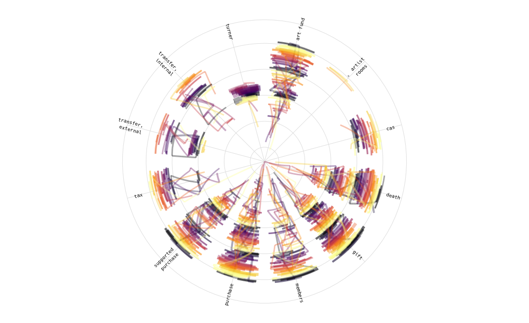
So, let’s now turn out geom_path() into more of an artwork. At the moment the spoke axis labels are horizontal, and while this is good for general readability, it’s not art4, let’s rotate the axis labels so that the align with the angle of their spoke.
why_year_reasons <- why_year %>%
  distinct(reason) %>%
  mutate(angle = (row_number()/nrow(.)*360) - (1/nrow(.)*360)/2,
         text_angle = case_when(
           angle < 180 ~ 90 - angle,
           angle > 180 ~ 270 - angle),
         hj = if_else(angle > 180, 1, 0))
While we know there are 12 categories in our data, let’s be useful and make our code generic and theoretically work for any number of labels. First let’s just get the a unique set of the reason values, to calculate the spoke angle we can calculate this as its relative position in the rows of the table (row_number()/nrow(.)) multiplied by 360º. We then need to subtract an offset as coord_polar() does not start/end the axis labels at 0º, we calculate this as half the angle of the first item in the table. This gives us a reference angle from the vertical, however our text is horizontal (i.e. 90º from the vertical), so we need to adjust the angle and to make it readable all the way round we will need to change our transformation after the 180º point. As we are changing the transformation at the 180º point we also need to change whether the text is left- or right-justified. This information can then be used in a call to geom_text() to create text labels which we’ll use in place of the regular axis labels.
ggplot(why_year, aes(x = reason, y = year, size = n, colour = decade)) +
  geom_path(position = "jitter", alpha = 0.35) +
  geom_text(data = why_year_reasons,
            mapping = aes(x = reason, y = 2030, label = reason,
                          angle = text_angle, hjust = hj),
            size = 2.5, inherit.aes =  FALSE) +
  coord_polar() +
  scale_color_viridis_d(option = "inferno")
Rotated text labels
Now let’s start to consider theming our plot. We can work with a blank canvas by using theme_void() which removes background, gridlines, axis titles and labels5, and then use theme() to modify/add back in various theme elements. First let’s get arty and use a black background, we’ll also drop the legend (as which has also been applied in previous plots) and set a margin around the plot. We also need to give the text labels a colour (as their default is black).
ggplot(why_year, aes(x = reason, y = year, size = n, colour = decade)) +
  geom_path(position = "jitter", alpha = 0.35) +
  geom_text(data = why_year_reasons,
            mapping = aes(x = reason, y = 2030, label = reason,
                          angle = text_angle, hjust = hj),
            size = 2.5,
            colour = "#ffffffaa",
            inherit.aes =  FALSE) +
  coord_polar() +
  scale_color_viridis_d(option = "inferno") +
  theme_void() +
  theme(
    legend.position = "none",
    panel.background = element_rect(fill = "#000000"),
    plot.background = element_rect(fill = "#000000"),
    plot.margin = unit(rep(0.5,4), units = "cm")
  )
Black background
That’s definitely more like it. But let’s add back some gridlines, we can use geom_hline() and geom_vline() to create custom gridlines on our plot6. By putting our horizontal gridlines first and then adding black vertical gridlines that are offset by 0.5 we can generate arcs for each century from 1700 that sit under each set of paths. Let’s also set the size to log(n) to reduce the variation in the width of the lines and make them look more like strokes using the same brush.
ggplot(why_year, aes(x = reason, y = year, size = n, colour = decade)) +
  geom_point(alpha = 0) +
  geom_hline(yintercept = c(17:20) * 100, colour = "#ffffff33", size = 2) +
  geom_path(alpha = 0.5, position = "jitter") +
  geom_vline(xintercept = (0:11) + 0.5, colour = "#000000", size = 2) +
  geom_text(data = why_year_reasons,
            mapping = aes(x = reason, y = 2030, label = reason,
                          angle = text_angle, hjust = hj),
            size = 2.5,
            colour = "#ffffffaa",
            inherit.aes =  FALSE) +
  coord_polar() +
  scale_color_viridis_d(option = "inferno") +
  theme_void() +
  theme(
    legend.position = "none",
    panel.background = element_rect(fill = "#000000"),
    plot.background = element_rect(fill = "#000000"),
    plot.margin = unit(rep(0.5,4), units = "cm")
  )
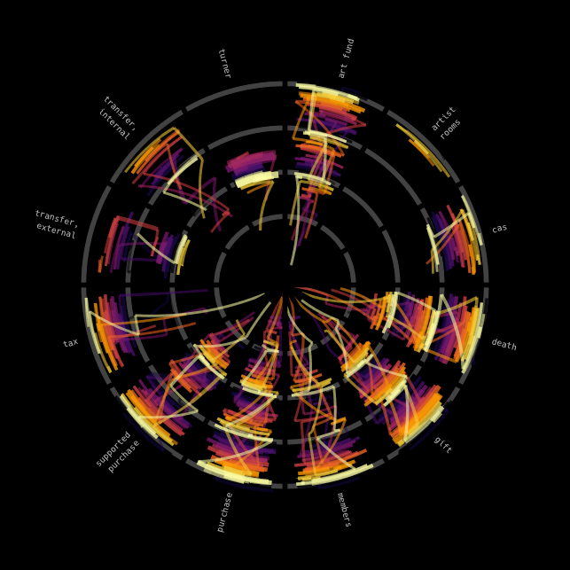
Plot with century arcs
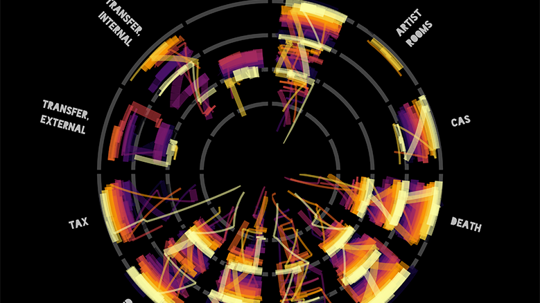
Now finally, let’s use a more artistic font7 and add a title to the plot. I decided to use the Blackout font family by Tyler Finck at The League of Moveable Type which are a blocky set of fonts that has the interior holes of letters filled - the perfect fonts for some modern aRt.
p <- ggplot(why_year, aes(x = reason, y  = year, size = log(n), colour = decade)) +
  geom_point(alpha = 0) +
  geom_hline(yintercept = c(17:20) * 100, colour = "#ffffff33", size = 2) +
  geom_path(alpha = 0.5, position = "jitter") +
  geom_vline(xintercept = (0:11) + 0.5, colour = "#000000", size = 2) +
  geom_text(data = why_year_reasons,
            mapping = aes(x = reason, y = 2050, label = reason,
                          angle = text_angle, hjust = hj),
            family = "Blackout Midnight",
            colour = "#ffffffaa",
            inherit.aes =  FALSE) +
  ylim(1500,2100) +
  coord_polar() +
  scale_colour_viridis_d(option = "inferno") +
  scale_size(guide = guide_none()) +
  labs(
    title = "Tate Collection by \nreason of acquisition",
    caption = "Matt Kerlogue, 2021\nhttps://github.com/mattkerlogue/tidytuesday"
  ) +
  theme_void() +
  theme(
    text = element_text(family = "Hack", colour = "#ffffffaa", lineheight = 1.1),
    title = element_text(family = "Blackout Sunrise", size = 24),
    plot.caption = element_text(family = "Hack", size = 8),
    legend.position = "none",
    panel.background = element_rect(fill = "#000000"),
    plot.background = element_rect(fill = "#000000"),
    plot.margin = unit(rep(0.5,4), units = "cm")
  )

ggsave("file/path.png", p, width = 20, height = 25, units = "cm")
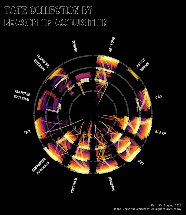
And there we have it, my first piece of aRt.
-
The code covering my initial investigations of the dataset is here ↩︎
-
The Acceptance in Lieu scheme was established in 1909, and is managed by Arts Council England. According to the 2019/20 Annual Report for the scheme, in the year to 31 March 2020 the scheme accepted 52 objects totalling £65 million in value in place of £40 million worth of tax owed, the total amount of tax that the scheme is allowed settle. ↩︎
-
Using
↩︎geom_step()would give me some good opportunities to embed songs though. What a tragedy that I’ve decided not to use it. -
Let’s try not to get too existential. This plot definitely isn’t art… yet. ↩︎
-
The previous plots use a custom theme of mine
mattR::theme_lpsdgeog()rather than the standard{ggplot2}theme, however the call to this theme is excluded from code snippets. ↩︎ -
For some reason, I think because of
{ggplot2}being additive and having the x-axis set to a character vector, we need to call a layer using the underlying aesthetics first and so the linegeom_point(alpha = 0)is included to add a set of invisible points to the plot first(). ↩︎